This post will review my second step in developing an App; Layout and Wire Framing. Once you have the basic idea for the App, and the basic user requirements, the next step that I follow is to layout the main interface for the App. For me, this activity serves as a first pass through how the user will interact with the app, and it also blocks out the main functionality that the App will need to have.
For wire framing, you can use anything from paper and pencil, to a specialized program. A few apps that I use on the iPad include iMockups for iPad and Noteshelf for iPad.
When laying out an app, you need to determine if the App is targeted for the iPhone/iPod, the iPad, or both. For the Webpage to PDF App, we want to target both the handheld and tablet form factors. When laying out the App, it is important to think about how the user will interact with the app when it is run on a handheld or tablet, and try to optimize the user experience based on the different devices.
For the Webpage to PDF app, we have identified two main functional paths ... selecting and viewing PDF Files, and selecting, viewing and converting web pages.
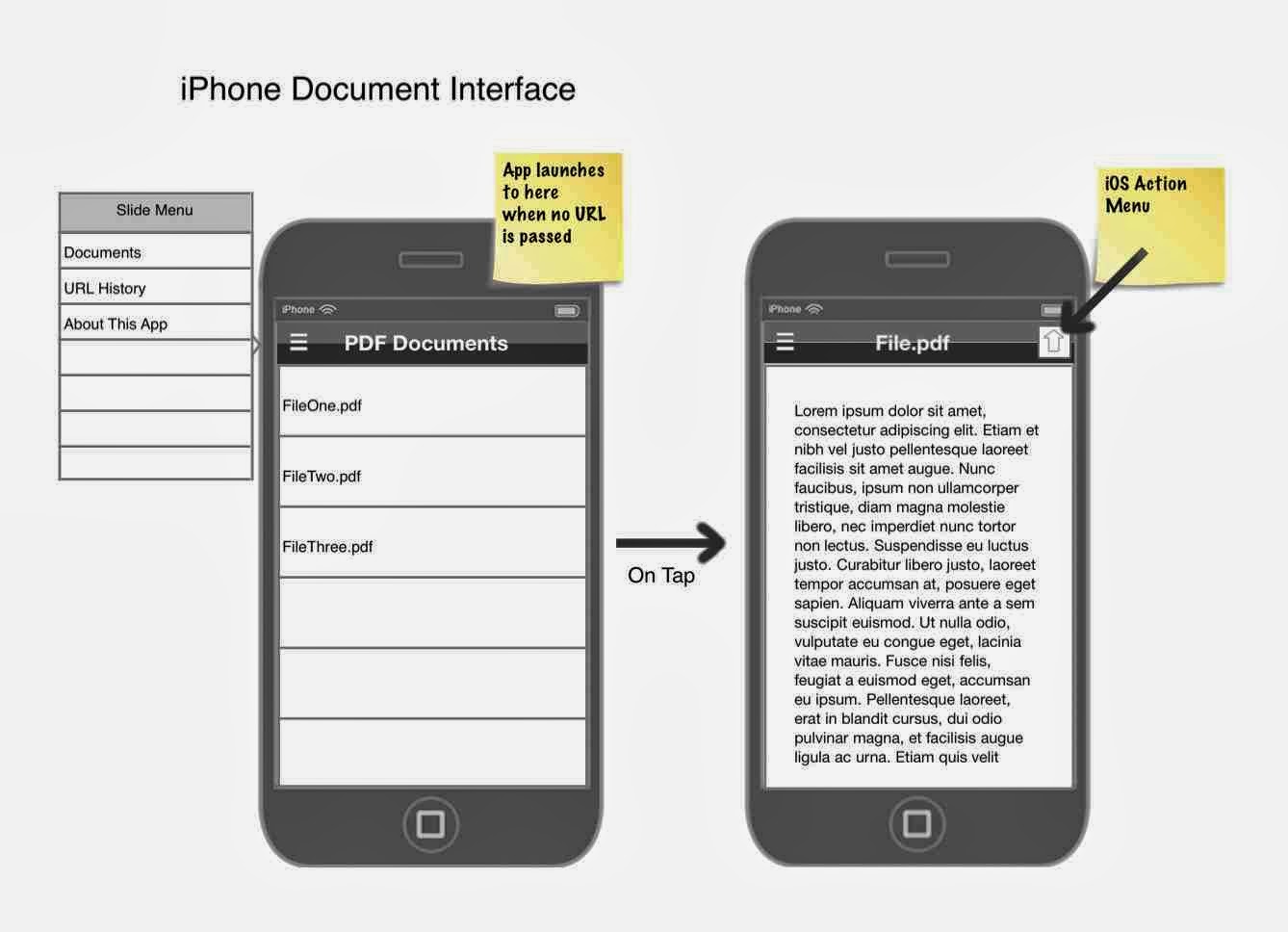
On a handheld device, these two functions will be handled similarly. There should be a list (or "TableView" to display the list of documents, or URLs. When a user taps on one of the list items, the phone will show the item full screen. On the iPad, there is more screen real-estate, so we can display both the list and the content at the same time.
For a complex App, you should probably run the layouts by a User Experience (or UX) expert. I happen to know one, so if he has any comments ... I'll add them to post.
The pictures below show the App layout that I did using iMockups.
With the layout drafted, it is time to start the programming.
Up Next ... Development Tools. In the next post, I will discuss the tools that I use for app development.
See anything missing from the layout? ... add a comment below!
Previous Part 1
Next Part 3 - Tools


No comments:
Post a Comment